
Color alphabet

Colours in space can be passive, active or neutral. Strong colours-especially red, orange and yellow - are active colours that give people extra energy. Colours that make one think of heaven and water-blue, green and mauve - are passive and have a calming effect on people.
Colour is a sensory experience which occurs when light of a specific spectrum induces the receptors in the eye’s retina. Colours are also prescribed to object surfaces, materials, light sources etc. depending on their absorption, reflection or emission properties.
Colours are traditionally divided into primary and secondary.The three primary colours are: red, yellow, and blue.They are considered primary because they cannot be made by mixing other colours.
The three secondary colours are made by mixing the primary colours: red + yellow = orange, blue + yellow = green, and blue + red = purple. There are also tertiary colours, made by mixing primary and secondary colours (for instance, teal, chartreuse etc.).
Colours are also divided into warm (red, yellow, orange), and cool (blue, purple, green).
This division stems from the association with nature and temperature (red - fire, blue - the sea).
Brown, coffee, and similar colours are called neutral.
Complementary colours are pairs of colours which, when combined, cancel each other out.
They are located on the opposite sides of Ostwald’s colour system.They are: orange and blue (because orange is made by mixing red and yellow, that is, it doesn’t contain blue), purple and yellow, red and green.
The colours of the rainbow make up a spectrum of six colours (primary and secondary), which can be seen by exposing a three-sided crystal prism to a ray of light.
Colours also have symbolic meaning.For instance, gold (especially in Christian painting) represents the emanation of the Spirit and holiness, while purple is associated with sovereigns, due to Roman emperors who inherited the title were called Porphyrogennetos (born in purple), which relates to a rare kind of purple stone named porphyry, brought in from Egypt.
The symbolic meaning of colours changes depending on the context.For instance, red is the colour of love, but in politics it symbolizes communism.Green is the colour of hope, but also of Islam, and environmentalists.In the European cultural circle, black is the colour of grief and penance, but in India, white is used in that context.Other colours are also symbolic: yellow is the colour of Judaism, but also of Vatican; black is the colour of fascism and terror; pink symbolizes optimism, purple is used for jealousy etc.
Colours are more than pleasing visual combinations.They also represent a kind of non-verbal communication.In addition to being symbolic and meaningful, colours are sometimes responsible for certain physical reactions.
It has been proven that red increases blood pressure, yellow encourages and makes people happy; orange has a festive and joyous feeling to it; green is calming and it creates inner peace; blue is calming and enables us to focus better; purple calms down desire, and white is tiring.
Colours can be passive, active, and neutral, but can also have positive and negative meaning.
Every colour has a specific psychological effect.Here are some examples of colours and their effects:
Red - strong, fixes mood, speeds up pulse, breathing and muscle tension. Red stands for love, passion, and joy, but some shades of this colour (dark red) symbolize the Devil and revolution.
Red is a strong colour, and has the longest wavelength on the light spectrum.It can cause powerfulphysical and emotional reactions.It appears closer than it really is, and makes us focus on it.Looking at the colour red can increase heartbeat and speed up breathing, which can be useful if you need a bit of encouragement.It is associated with love, warmth, and pleasantness.Red is an intensive colour which causes excitement.
Yellow - encouraging, brings joy, and represents hope.It is highly visible and is used often in traffic.
The positive meanings behind this colour are prudence, clarity, intelligence, joy, organization and spring; and the negative ones are laziness and cynicism.
Yellow is the hardest colour for the human eye to decipher - it has been noted that too much yellow can cause nausea and headache.Exposure to the colour yellow can trigger mental activities and increase energy.It also increases focus, so it is often used on notebooks.Yellow is considered to be a happy and optimistic colour.However, yellow can also cause anxiety and a lack of self-esteem.
Orange - festive, happy, associated with health and a joy for life.Orange stands for stability, courage, confidence, friendship, warmth, and energy.Negative meanings are ignorance and inferiority.
Being a combination of red and yellow, it is considered a warm and energetic colour.It has no calming effect, and it is strongly connected with ambitions and new stages of life.In colour therapy, it is used for healing the lungs, and to increase a person’s energy level.Physiologically, it increases blood flow to the brain, which can increase one’s mental activity.It can be spotted easily, so it is often used at construction sites or places where there is danger from injury.
Green - calming, soothing, brings inner peace, and rests the eyes.Green is associated with wealth, health, nature, hope, growth, freshness, and responsibility.Also, it can represent envy, guilt, jealousy, and disturbance.
Green is situated in the middle of the light spectrum, and it is popular in hospitals because it creates an environment fitted for education and health.One of the reasons for that is its strong connection with nature.Many symbols and logos use green as their primary colour.After being associated with fertility, it was often used at weddings in the 15. century.It’s easyon the eyes, and it creates a calming effect, which is why its often used in interior decorating.Researchers have also found that green improves reading skills.Some students have found that holding a transparent green paper over their reading material actually increases reading speed and understanding.
Blue - calming, the opposite of red, passive, cold, increases concentration.Blue represents calmness, love, aristocracy, acceptance, patience, understanding, cooperation, comfortableness, loyalty, and safety.The negative meanings of blue are fear, cold, passivity, and depression.
Blue is considered to be a calming colour, but also the colour of the business world.For that reason, many rooms are in blue, because it helps create a calming effect with people.Also, blue can contribute to depression, because an excess of it can seem cold and sad.Blue lowers our pulse, and bodily temperature.
Purple - mystical, mysterious, dazzling; it also calms down tempers.Purple is associated with magic, sophistication, and faith, but on the other hand, it can also represent a kind of prohibition.
This colour is rarely present in nature.It has the shortest wave length in the light spectrum, it is beneficial for meditation and pondering.Because of its rarity in nature, it became a symbol of wealth and power.
White - tiring.White symbolizes cleanliness, freshness, and kindness, but it is also synonymous with winter, the cold, and distance.White is a totally reflective colour.It is considered clean and sterile, which led to it being popular in the medical profession, where sterility is of utmost importance.
Black - serious, elegant, dramatic, and loyal, but also linked with evil, death, emotional coldness, and ignorance.Black absorbs all colours in the light spectrum.This property seems menacing, which gives a lot of people a fear of the dark.It creates absolute clarity in writing, which is why it is in great balance with white.It is also the densest colour, which makes it give the appearance of weight to black objects.Black is commonly used in fashion and design, due to its effect of narrowing the shape of the human body.
Brown - a colour with evolutional ties to our brain, because it suggests food is edible or ripe.
It is strongly connected with nature and the soil, just like green. It is the second favouritecolour between men, right after blue.It is associated with warmth and comfortableness, and can help people feel safe and secure.
Pink - considered to be a “woman’s” colour, soothing, romantic, and associated with gentleness.
Gray - has almost no psychological impact on humans. Business suits are usually grey, so we can link it with self-confidence or independence.It emphasizes a lack of colour and vitality, which can cause depression.It is also linked with the measuring of time - the start of winter hibernation, the days being shorter, and the nights longer.
The human eye perceives warm colour as being closer, and cool ones as being more far away, even though they are at the same distance.
Are you nervous when you enter a room full of yellow?Does blue calm and relax you?Artists and interior designers understand how colours can dramatically impact mood and emotions.Some colours increase our blood pressure or speed up our metabolism.Naturally, your sense for certain colours is often associated with your experiences or the culture you live in.For instance, while white symbolizes purity and innocence in many Western countries, in some Eastern countries it symbolizes grief.
In space, colours can be passive, active, or neutral.Strong colours (especially red, orange, and yellow), are active colours, which give people energy.Colours which remind us of the sky and water (blue, green) are passive colours, which have a soothing effect.Grey is neutral, and has no special effect on the human psyche.Green is most acceptable to the eye, while yellow is irritating.
For the bedroom, you should use shades of green, blue, and purple.They have a calming effect, and can contribute to the romantic mood between you and your partner.If you want to bring harmony and calmness to your bed room, use just two tones of neutral or passive colours.

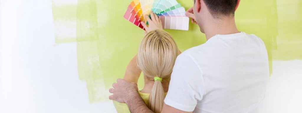
When decorating or remodelling interiors, the hardest choice to make can be choosing colours, especially of walls.The appearance and mood of a room will be mostly impacted by a good choice of wall colours.When choosing colours, coordinate the colour of the walls with the colour of the furniture, the purpose of the room, and your favouritecolours.Bear in mind that the furniture you buy after painting should be coordinated with the colours you choose.
How to pick colours?
Start with the colour wheel - primary (red, blue, yellow), secondary (orange, green, purple), and tertiary colours (which are a mix of primary and secondary colours, and depending on the ratio, different shades can be made).White and black are commonly used when combining colours, to achieve a brighter or darker shade.
https://www.shutterstock.com/image-photo/couple-paint-swatches-choosing-colors-painting-183169598?src=iaxenrhWIMcxfYViFU4O-Q-2-38
Do you want warm or cool colours?Red can lift the atmosphere of the room, but it is recommended to use it in order to emphasize only one part of the room.Child bedrooms shouldn’t be painted red because it may irritate the children.Orange and yellow give warmth to a room, so it is recommended to use them in rooms facing north.Cooler colours, like green or ice, are considered to be calming, and they should be used in bedrooms.Grey or dark blue are shouldn’t be used in kitchens or dining rooms.
Bright green, blue, orange, and yellow shades make the room seem more spacious, and they are recommended for the kitchen and dining room.
Make your own colour scheme
Use a colour wheel to make a scheme best suited for you.
There are four possible colour schemes:
Harmonious colour schemes
Are colours are concordant, and are not in opposition.They are soothing - no colours demand special attention.There are two types of harmonious schemes:
A single colour scheme consists of one colour of weak intensity, such as bright beige, bright grey, or white, in a limited range of values.This scheme is often used for showrooms, because its calmness creates a perfect backdrop.If you want to emphasize an object in a bright and noticeable colour, this scheme will definitely give it it attention because it will disrupt the monotone scheme.
A monochromatic scheme makes the whole space feel special.It consists of one colour, but in a wider value and intensity range.A monochromatic scheme based on yellow can contain bright yellow,lemon yellow, and golden yellow, which can be used individually, or combined.
Contrasting schemes
Unlike harmonious schemes, contrasting schemes divert attention onto themselves.The choice of colour is not accidental, but it represents a focal point.There are a few types of efficient contrasting schemes.For starters, contrast can be achieved by using analogue colours, which means that you can combine blue with turquoise - they are located next to each other on the colour wheel.Sometimes analogue colours will not yield the biggest contrasts; instead, they will look like harmonious schemes.
Another option is to combine two complimentary colours situated opposite each other on the colour wheel - like blue and orange. You can also use blue with a couple of shades of orange, or vice-versa.
If you’re adding more colours, you are creating triadic contrasts, and you can expand the whole scale with extra shades of each colour in the triad.Furthermore, appealing and harmonious contrasts can be achieved by using warm and cool colours, and expand upon them by using different patterns and materials.
Applying the selected colour palette
When decorating a room, it is recommended to start with the furniture and carpet, items that are difficult to choose, and are among the expensive ones.After choosing your furniture, choose the colour of the walls.
Be careful when choosing wall paint- it’s cheap and can be mixed in any colour or shade you want.
You can emphasize the furniture or the walls.For instance, you can choose neutral furniture and combine it with daring and intensive wall colours, or use brighter wall colours to emphasize the furniture.
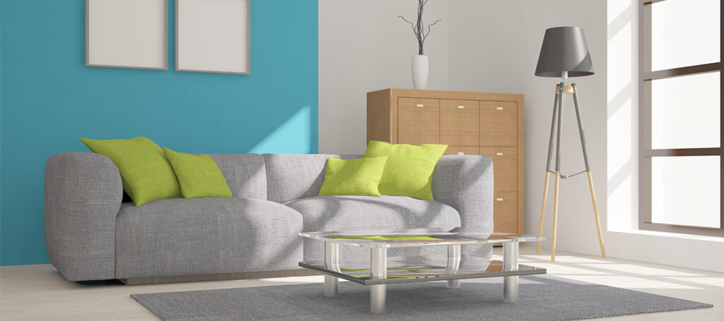
Wall colours - living room
The living room is the room you spend most of your time in.You can experiment with colours, but do not make too big of a contrast between the colours of the furniture and the walls.The best choice for living rooms are pastel colours.Brighter colours, such as beige or light yellow, will give the spacewarmth, while cooler colours, such as grey, will make the atmosphere seem more formal.Bright colours are not recommended, especially bright red. While wine or chestnut tones can fit very well.
Wall colours - kitchen and dining room
Choose pleasant colours, to make cooking and dining as comfortable as possible.In addition to combining it with the colour of the rest of the kitchen, the colour of the kitchen walls should also becombined well with the colour of the tiles or protective glass.Light and gentle tones are best suited for kitchens.Peach, brown, or yellow are a good choice. Stronger colours, like brick-red can emphasize neutral colours.Earthy tones in the dining room provide a sense of warmth, and red or orange increase appetite.Cooler shades of grey or blue are not recommended for this part of the home, because they decrease your appetite.
Wall colours - bedroom
The purpose of the bedroom is to relax and sleep, so the colours of the walls have to be chosen with that in mind.Colours best suited for this room are blue, purple, grey, or beige.Neutral shades of those colours will help you sleep more easily.Orange and red are not recommended because they make you feel more awake.
Green, blue, and light earthy tones are recommended.Peach, pink, and chestnut can set a romantic mood.
Wall colours - children’s room
The walls of children’s rooms can be in a variety of colours.The colours should be vibrant, but not excessively bright or fluorescent, because those colours can make children aggressive.If you’re decorating a baby room, use lighter and delicate colours.The children’s room can have a different colour on each wall, or even two contrasting colours on the same wall.Make the walls even more interesting by using stickers.
Colours are an important decorative element in interior design, and can influence the style, beauty, and cosiness of your home.It is important to choose your colours carefully, maybe consult an expert, and take extra time in order to find colours which will make your home great.
These are some most common mistakes concerning colours and interior decorations:
The decoration colour is the same as the dominant objects in the space
If you want to bring out the central objects of a room, such as living room furniture, choose decorations of the same colour, but in lighter and gentler shades.Totally matching colours close up the space, and do not emphasize any element. If you have darker furniture, choose carpets, decorative pillows or similar items in a brighter shade.
Choosing white or cream because you think you can’t go wrong with them
If you think that choosing these colours would be the easiest solution, and that you can’t go wrong with them, think again.Even neutral colours, such as white, grey or beige, come in numerous tones and shades. You will also have to make a lot of effort to find the right one.
Use samples, and limit your self to three or four colours you really like, and which are appropriate for the space. When choosing wall colours, apply a sample on a part of the wall and observe the colour in daylight and during night-time.
Choosing too bright and too intensive colours
Too bright colours are mostly too intensive.A spacious and sunny room can “handle” lemon yellow or bright green, but a better option is to choose colours which will blend with the surroundings, make the space feel cosy, and hide the negatives sides of the room, if there are any.But if you’ve always wanted a living room in red, don’t choose a bright red shade - pick brick-red or raspberry red.
Colours unsuitable for the space
Warm colours are important for good mood and cosiness, so they are most appropriate for living rooms.Cool colours such as blue natural green, and lavender are soothing, which makes them a great choice for bedrooms.
On the other hands, green bathroom walls or bright shades of yellow in the bedroom can irritate some people, so it is advisable to think your choices through - think about how you want to feel and what you want to accomplish with the colour you have chosen.

